BROOKLYN LAGER OPTIMIZATION
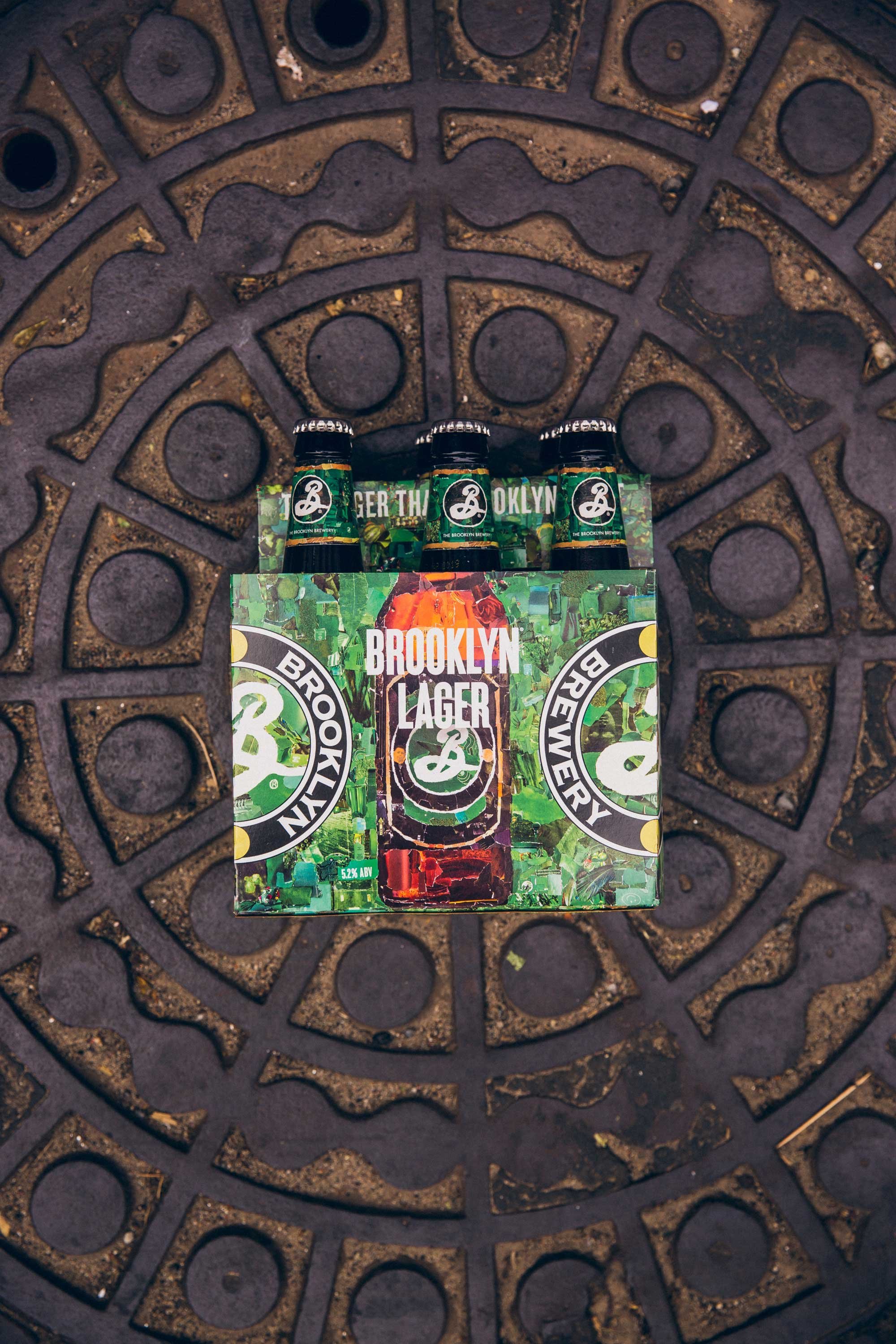
Original collage packaging was designed by Doyle Partners in 2018, and refreshed in 2020 under the Art Direction of Ashley Swope. Consumer feedback consisted of low shelf stand out, collage being confused as camouflage, and the text not being legible.

PACKAGING
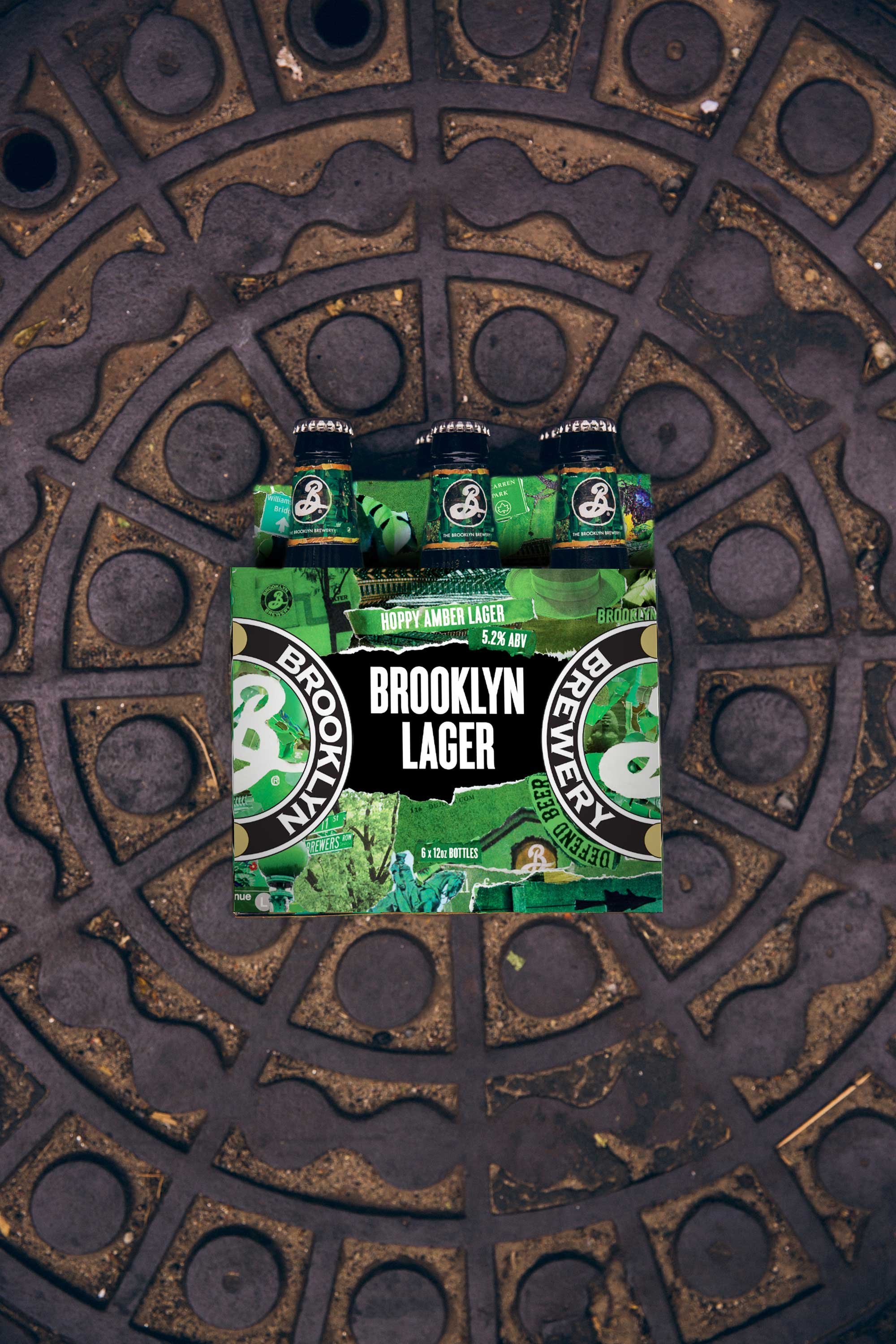
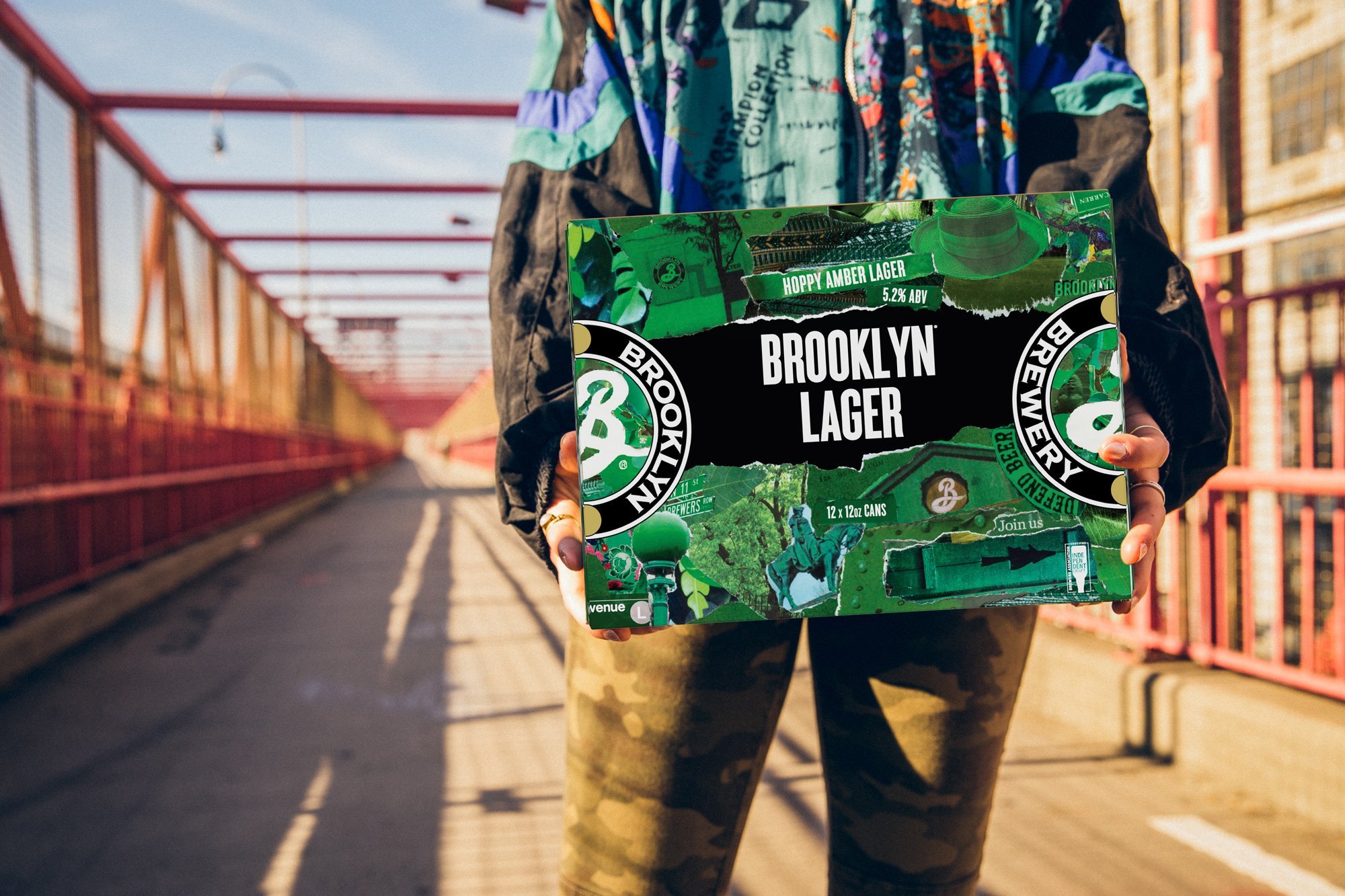
The collage, meant to communicate the many components of Brooklyn (the borough) coming together, wasn’t visually achieving this goal. Specific collage pieces were selected and blown up in scale to help tell a story for the brand. Important information, such as the beer style and ABV, were highlighted in their own pieces of paper towards the top of the package, and the beer name was placed within the negative space left between the collage tears to increase contrast and legibility. Overall, the goal was to simplify and create a cleaner package with higher visual impact.